- Return to book
- Review this book
- About the author
- Introduction
- 1. What Is A Font?
- 2. Trusting Your Eyes
- 3. Planning Your Project
- 4. The EM Square
- 5. Installing FontForge
- 6. Using the FontForge Drawing Tools
- 7. Drawing with Spiro
- 8. Creating ‘o’ and ‘n’
- 9. Font Info & Metadata
- 10. Word Spacing
- 11. Creating Your Type’s DNA
- 12. Capital letters
- 13. Line Spacing
- 14. Punctuation and Symbols
- 15. Completing the Lower Case
- 16. Diacritics and Accents
- 17. Numerals
- 18. Bold
- 19. Italic
- 20. Spacing, Metrics and Kerning
- 21. Making Sure Your Font Works, Validation
- 22. The Final Output, Generating Font Files
- 23. When Things Go Wrong With FontForge Itself
- 24. Designing Devanagari Typefaces
- 25. Importing Glyphs from Other Programs
- 26. Adding Glyphs to an Arabic Font
- 27. Further Reading
- 28. Glossary
What Is A Font?
— What makes typefaces different from hand-writing, calligraphy, lettering, and logos?
The single biggest issue that makes type design different is the need for every glyph in the typeface to work with every other glyph. This often means that the design and spacing of each part of the typeface ends up being a series of careful compromises. These compromises mean that we can best think about typeface design as the creation of a wonderful collection of letters but not as a collection of wonderful letters. In other words we must think about the group and how it will perform together and prioritize this over any question of what is wonderful in a single letter.
This need to prioritize with the system rather than with any single part also leads to a need to analyse our design process on the level of the system. Characteristics which span letters become the things we want to focus on, particularly at the beginning of the design process.
The other oddity in type design is that to a very large extent the forms we are designing are already significantly established. Our task as type designers is not so much to create an utterly new form but rather to create a new version of an existing form. This can perplex new type designers. Finding just the right amount to change in order to excite but not to alienate a reader is a tricky thing. Often designers get stuck in letter-specific thinking. This mistake can be easily avoided if you realize from the start that what is most meaningful in a typeface are the parts of it that repeat the most. Typeface design is not just about designing the characteristics applied to the common forms we all recognize, but also to the forms that occur most often.
It is also useful to recognize that these characteristics not only help to create a font’s voice or atmosphere, but also determine what the font will or will not be useful for, and they sometimes help determine the technological contexts for which a font is suitable.
It may seem intimidating or excessively abstract to think about the design of a font in this way. However, getting used to these ideas is the key to a faster, more effective, and satisfying type design process.
Let’s begin by identifying the main systemic characteristics in type design.
Construction
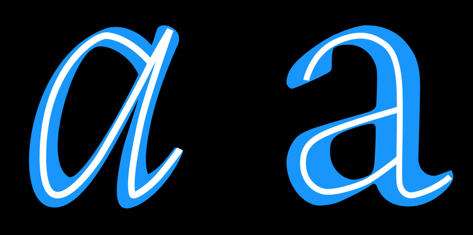
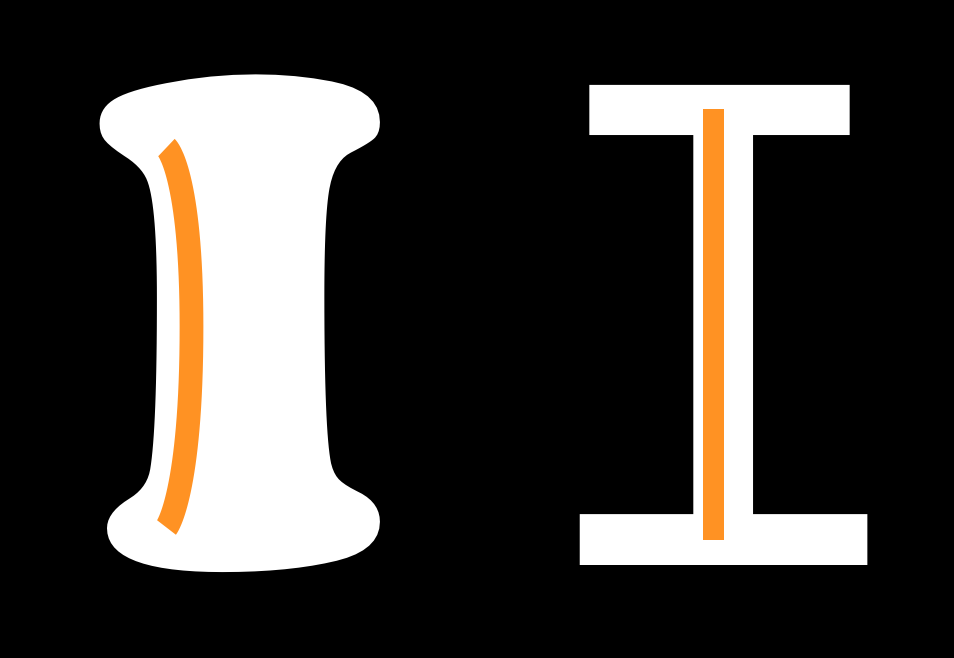
Construction refers to the underlying strokes that form a particular glyph. The kind of construction you use is arguably one of the most important questions to think about, because the construction effects so many of the remaining choices, particularly if your design is going to feel somewhat familiar to readers. In the example above, the white line inside the letters indicate the approximate construction suggested by the shape of the letters themselves.
Construction refers to the structure of the underlying strokes that form a particular glyph. Perhaps you can imagine the glyph’s skeleton. The kind of construction to use is arguably one of the most important questions to think about, because the construction effects so many of the remaining choices, particularly if your design is going to feel somewhat familiar to readers.
However, the way strokes end (the ‘terminals’) and the ‘serifs’ (see below) are generally not part of what is meant by ‘construction.’ Construction is the skeleton of the glyph, while rest – width, weight, terminals – are all parts of the flesh.
In the example above, the white line inside the letters indicate the approximate construction suggested by the shape of the letters themselves.
Proportion of X-height to Cap-height
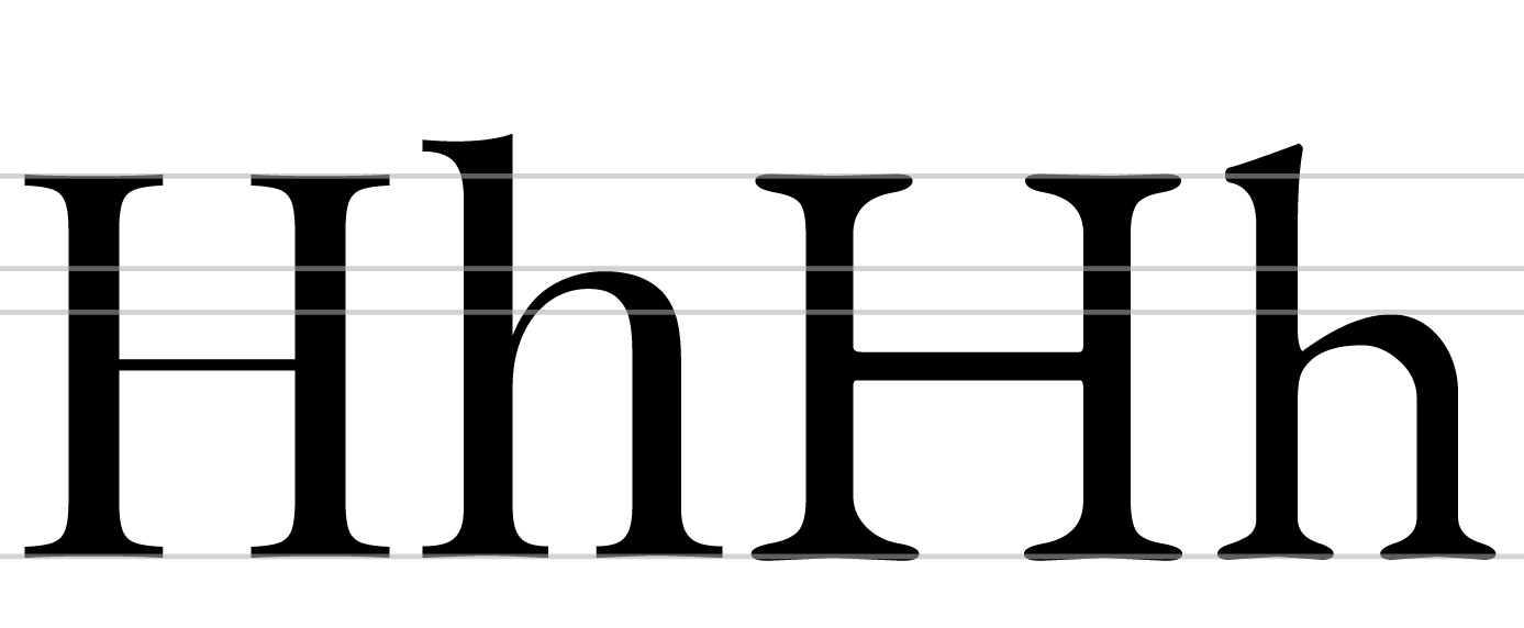
The letters on the left come from Playfair Display, which has a large x-height relative to its cap-height. The letters on the right are from EB Garamond, which has a smaller x-height. In the sample above, the size of the H has been adjusted so that they match.
Ascender Height

In the example above, the x-heights have been matched in order to illustrate the relative difference in ascender heights.
Ascenders usually exceed the cap-height by at least a little, especially in text designs. In some cases, however, they can match or even be lower than the cap-height. Longer ascenders can add elegance to the look of a typeface. They often go with smaller x-height.
Descender depth

Like ascenders, descenders that are long can feel elegant.
Taken together, long ascenders and descenders can become difficult to manage. If the typeface will be used with small line heights, the elongation means letter can collide across rows of text.
Width
The width of a type design will alter not just how it feels but also what it is useful for. The example on the right is from a text face. The example on the left is from a display design meant to be eye catching. Letters that are more narrow than the text face example are also possible and can be used to save space or to fit more text in a smaller space.
Width regularity versus variability
The letters in the top row of this example show a greater variety of width than do the letters in the bottom row.

Weight

Slant

Contrast
Contrast refers to how much variation in stroke width is found within a glyph. Notice in the below two ‘O’ glyphs that the one on the left has much greater variability in line thickness between the top and sides of the glyph. Both glyphs have some contrast, but the one on the left has much more than the one on the right.
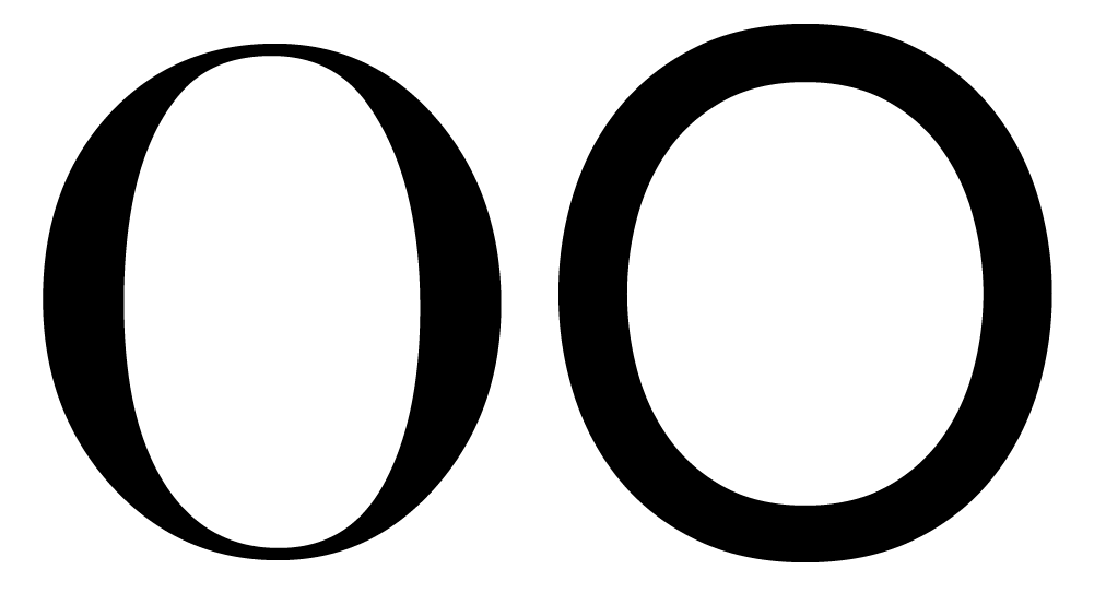
Type with consistent weight (stroke width) in its letterforms or no visible contrast produces a sheer distinction from uncontrasted type. Like the choice between serifs or sans-serifs, contrast is an early choice of type design. It is interesting to note that ‘slab’ serif designs generally use consistent stroke width in their letters, and that the design of slab serifs is not merely about the serif, as it sounds! It must be remembered that the rules of perception apply (see “Trusting your eyes”) – contrast is about how the weight looks but not how it measures out to be.
Angle of contrast
In the below image, we see that the thin parts of the lower case letter ‘o’ shapes are different. In the glyph on the left, the thin points lie on a perfectly vertical axis. In the glyph on the right, the axis is diagonal.

Weight distribution
If your font uses very little to no contrast, you don’t really need to think of it.
Most fonts, however, have at least some degree of contrast. In these cases, you have a wide variety
of options to choose from when it comes to how to distribute the weight in your font.
Vertical
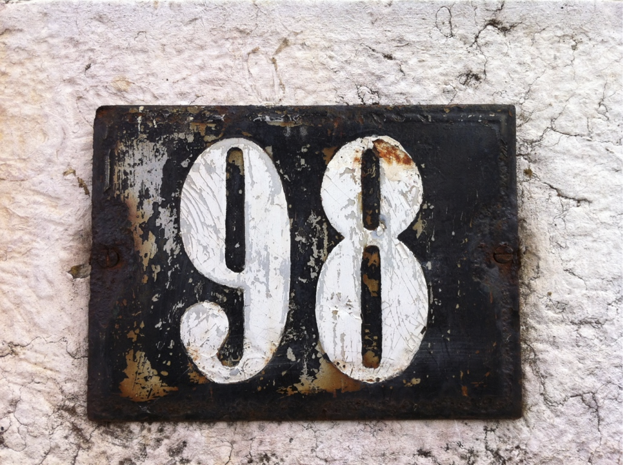
Vertical distribution of weight is very common. The 9 and 8 above are a particularly intense example.
Horizontal

Horizontal weight distribution is much less common, but is nonetheless seen in many fonts.
Bottom-heavy
Top-heavy

Irregular

Stems
It is easy to assume that your stems will simply be straight and that this isn’t a real concern, but both the weight and the shape of your stems are things you can and should make deliberate choices about.
Joins

Bowls
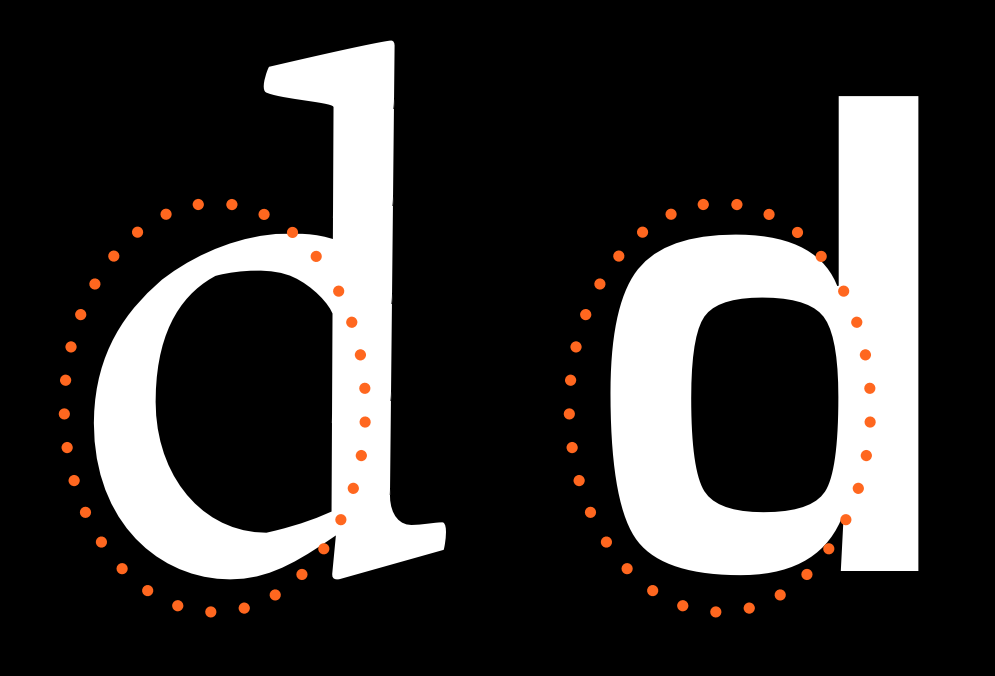
Note that bowls are the stroke part in the below illustrations and not the black inner forms. The inner strokes are referred as “counters”. While designing type, you will often find yourself altering your work not because of the shape or width of the stroke but due to the shape and size of the counter.
Terminals
Terminals are the end forms of the strokes. They are not same as the serifs. They are often perpendicular to the angle of the stroke at its end, or sheared horizontally or vertically. They may also reflect the shape of the nib or other mark-making tool that the letter forms evoke.

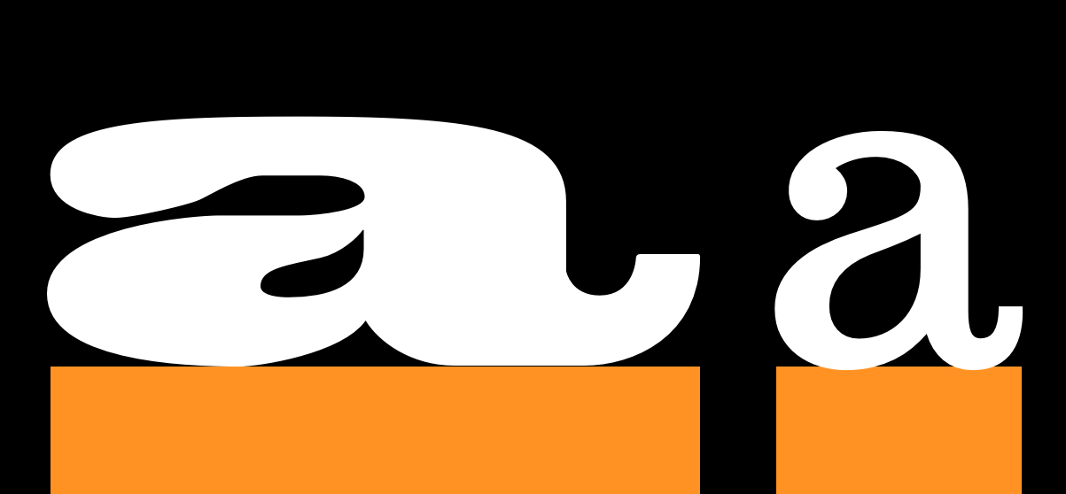
Speed
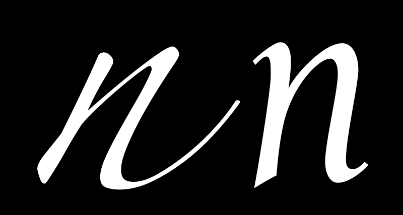
The ‘n’ on the left seems to be written much faster than the one on the right. Speed is discussed in more detail in the chapter on italics.
Regularity
The following characteristics are not present in all type designs, however they are variables that may be a part of your design. If this is the case, it is worth considering the degree to which they will play a role as a variable.
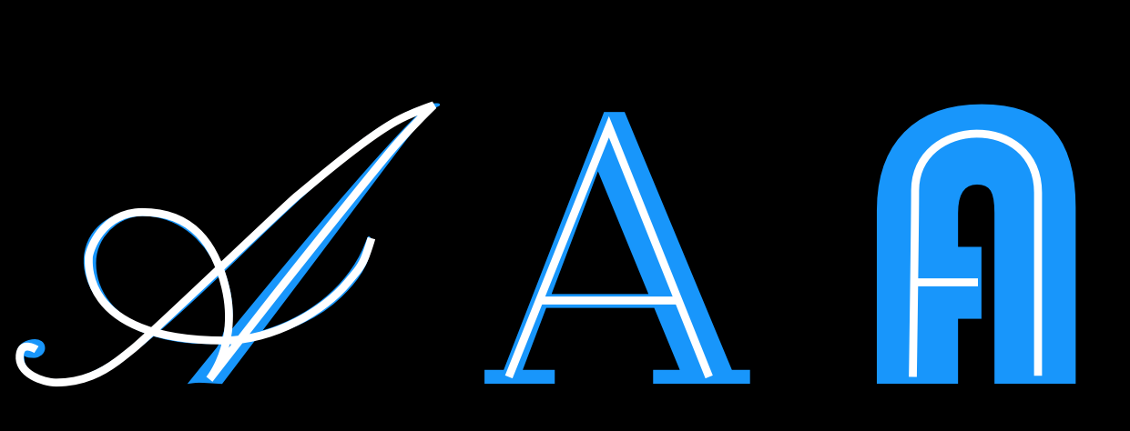
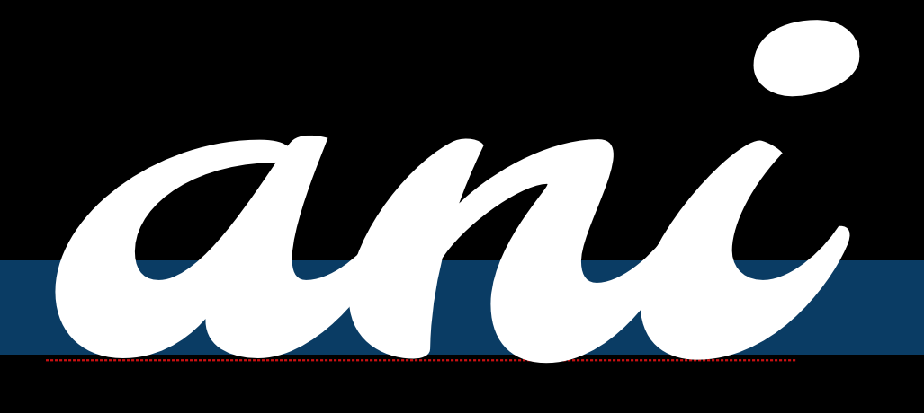
Flourish

Notice that in the font on top the flourish is more present in the capital letter and the second one the flourish is more in the lowercase.
Serif - To be or not to be
Serifs are one of the most distinct aspects of a typeface, and often the first classification of type is between serif and sans-serif type.
This choice affects how the end terminals will look like. Serifs can be two sided or one sided. They can be perpendicular to stroke or have their own direction (like being always horizontal or vertical). Serifs can be with or without brackets. Any serif design is a mix of all of the above applied consistently to the type design with some deviations for particular letters, especially the ‘S’, ‘C’ and ‘Z’ (e.g. a type with horizontal serifs for all letters will often have s, c and z to have vertical serifs).
There is a urban legend asserting that serif types are easier to read than sans-serifs – it is a sole myth, until further notice.
The form of the serifs are related to the forms of the terminals.
Brackets
The corner portions of a serif where it connects to the main stroke are called ‘brackets’. A particular design may have them giving a soft feel to the serif (Times New Roman is an example) or may choose to not have any bracket. Some designs also use brackets only on one side or with different proportions on the two sides.
This is a relatively strong parameter that renders feel to the type – elegance (smooth or large brackets of Times New Roman) or chunky crisp (absent brackets of Arvo).
Slab-serifs
Also called mechanistic or Egyptian type, slabs are thick, block-like serifs. Slab serifs don’t use brackets. Generally speaking, type design with such serifs are seen to have less contrast in their glyphs – Rockwell, Courier or American typewriter reflect that.
It may be safe to assume that slab serifs have been used to add some ornament or rhythm to an otherwise no-contrast type design. But this is not an absolute rule.
Serif Terminals
Just like letter terminals, the end shape of the serifs themselves contribute to the feel of the type – either soft or chunky. Serif terminals can be soft and rounded (Courier) or blunt and angular (Rockwell).
Decoration

Dimension